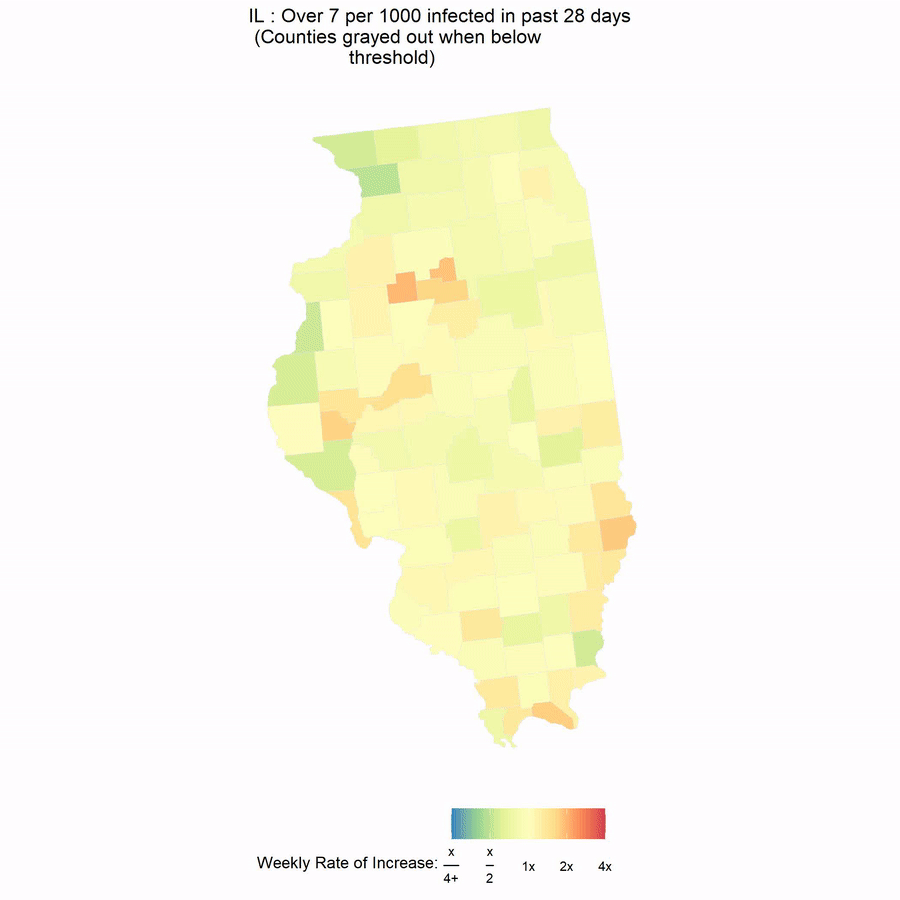
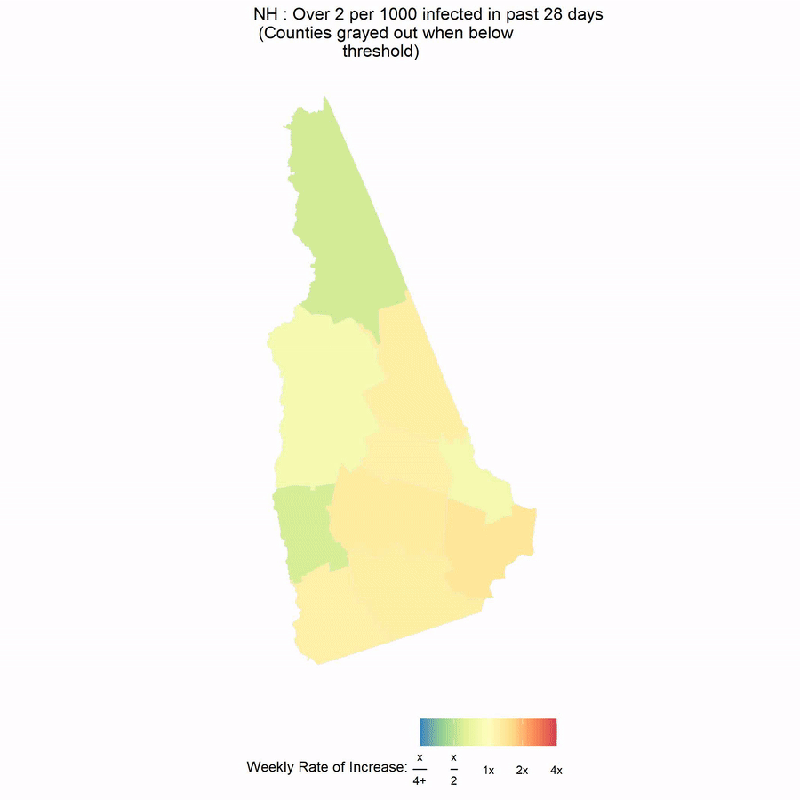
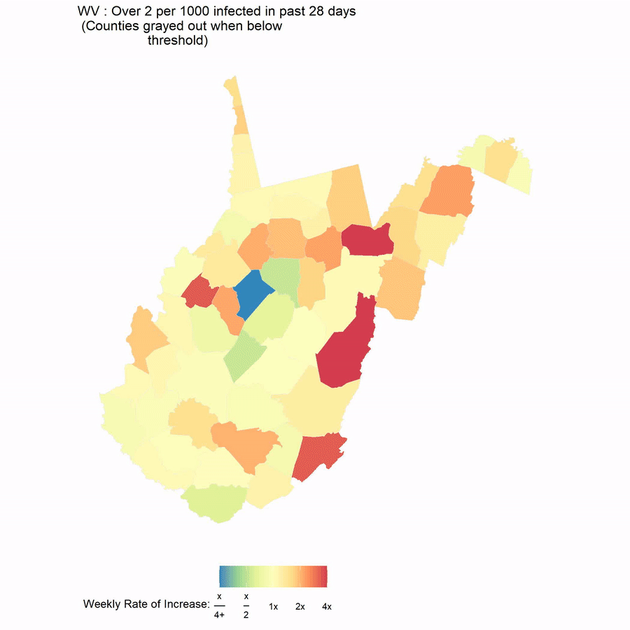
County by county coronavirus map GIFs. Show both per capita and rate increase of new cases.
Email if you want old ones.
MOST RECENT UPDATE GENERATED: 25NOV 12:06PM
data from usafacts.org
Link to Instructions
Color is coded by (This week total new cases) / (Last week total new cases).
GIF moves forward a frame by per capita new cases over the past four weeks.


Comments
Post a Comment